CIMB Niaga: Event Design for a Luncheon with Media Executives
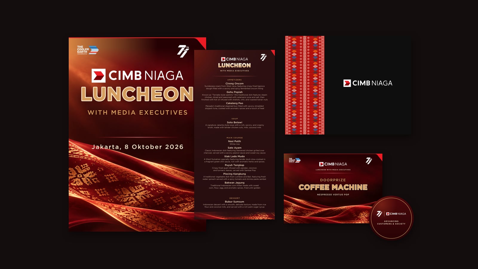
- Client PT Bank CIMB Niaga Tbk
- Event Luncheon with Media Executives, Jakarta, 8 October 2026
- Board WHITE Canvas
- Services Design development, guest personalisation, event collateral, packaging, signage, textile artwork, seating layout, 3D visualisation, print production files
- Timeline Five days, from first artwork on 4 October to the event
The brief
CIMB Niaga invited editors and executives from Indonesia’s media to lunch: an afternoon to say thank you in person. The key visual was already set, deep maroon, warm gold and a sweep of woven cloth. Our job was to carry it into every object a guest would hold, read, sit at or take home, and to have all of it ready for the printer in less than a week.
What we made
Guest pieces with names on them. Thank you cards, hanging cards and table name cards for every guest, external and internal. Instead of typing each name by hand, we generated the personalised pieces straight from the live guest list, so a late change to a name or a seat meant a re-render, not a redraw. The names stay with the guests, which is why you will not find those cards on this page.
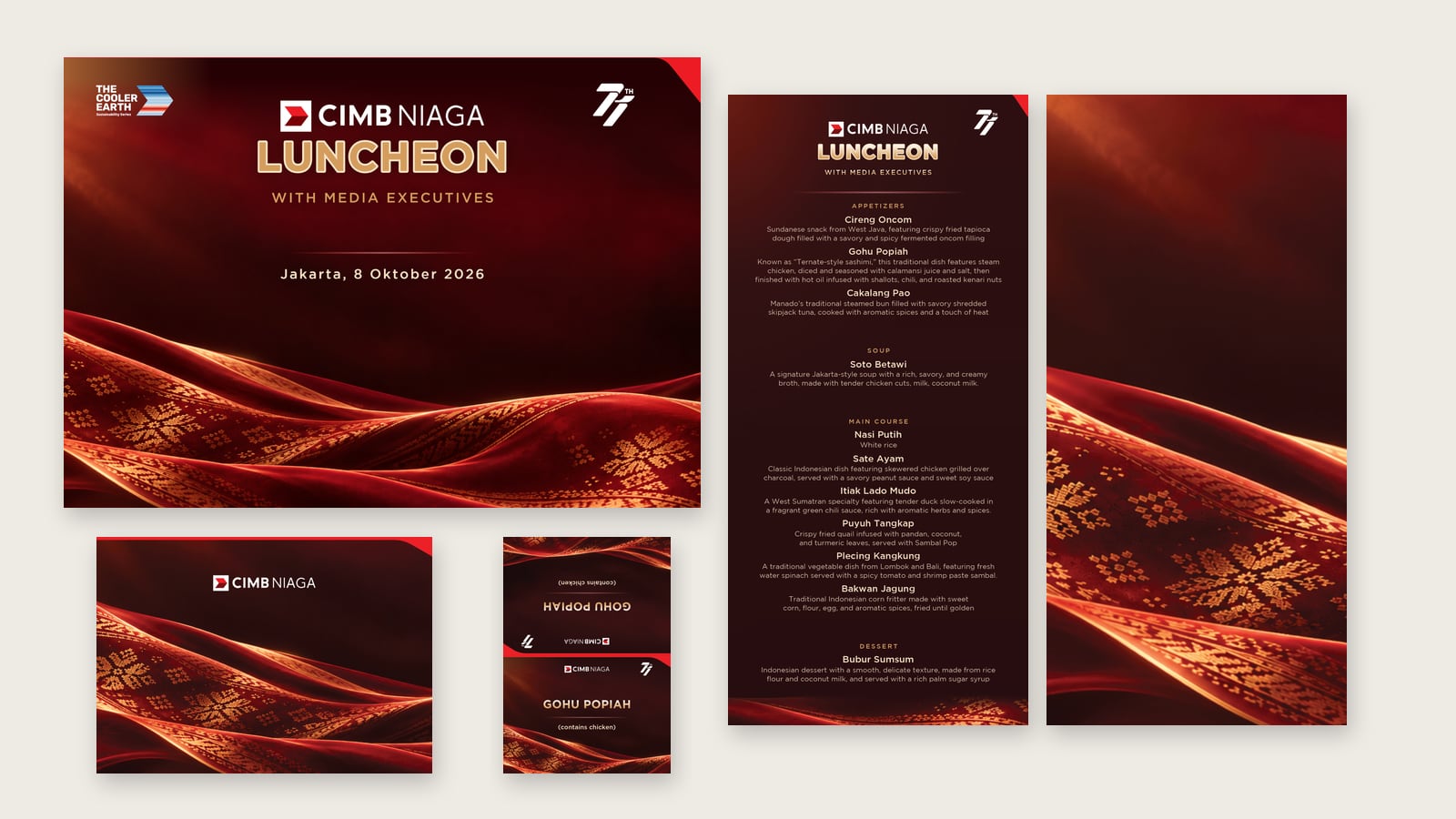
The dining table. A table mat, a single sheet menu that went through three versions as the kitchen’s list evolved, canape cards for Cireng Oncom, Gohu Popiah and Cakalang Pao, a two sided postcard for guests to write on, and a cue card for the MC.
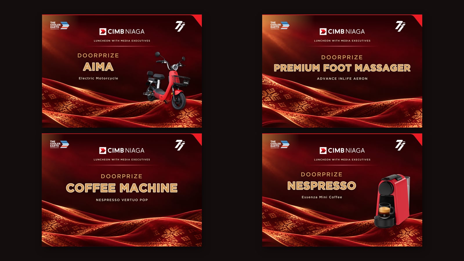
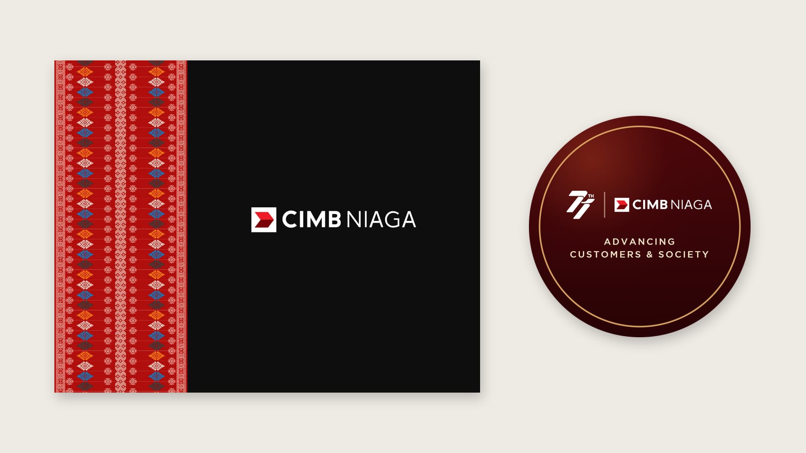
Gifts and packaging. Four doorprize boards, a black gift box lid wrapped with a batik ribbon, and a round sticker carrying the bank’s 71st anniversary mark.
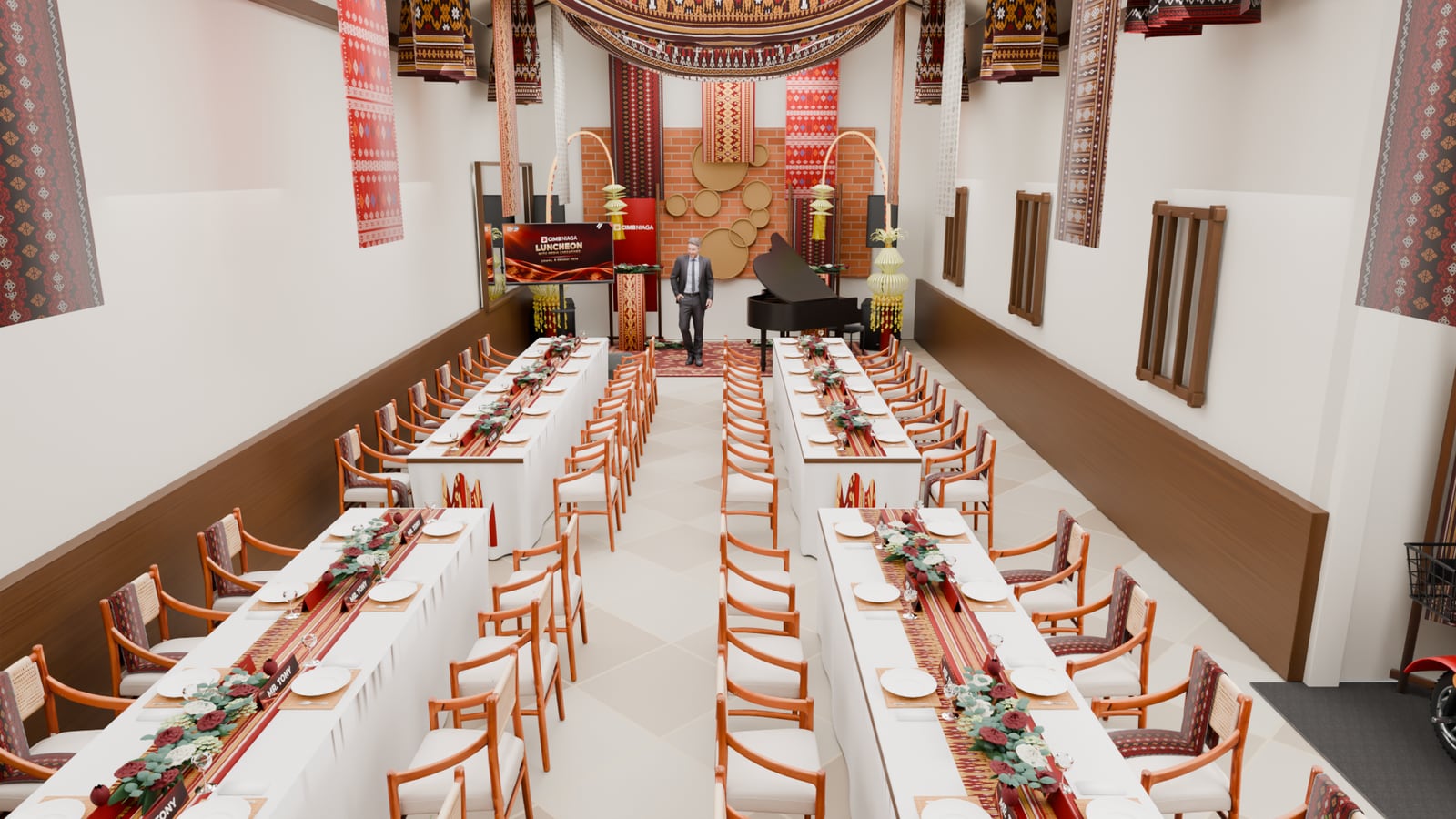
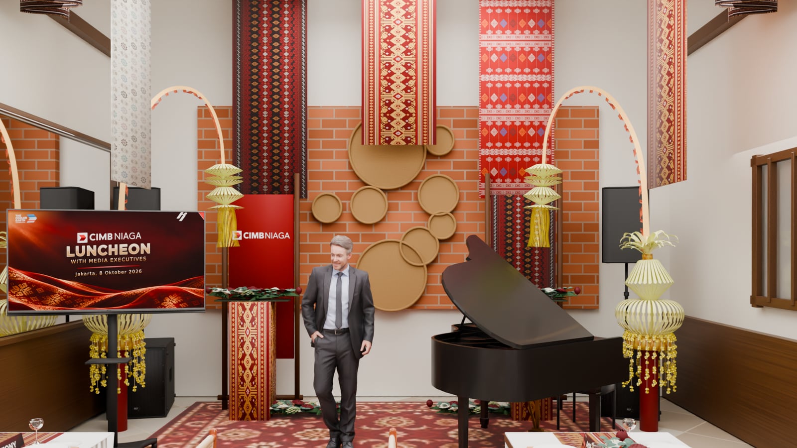
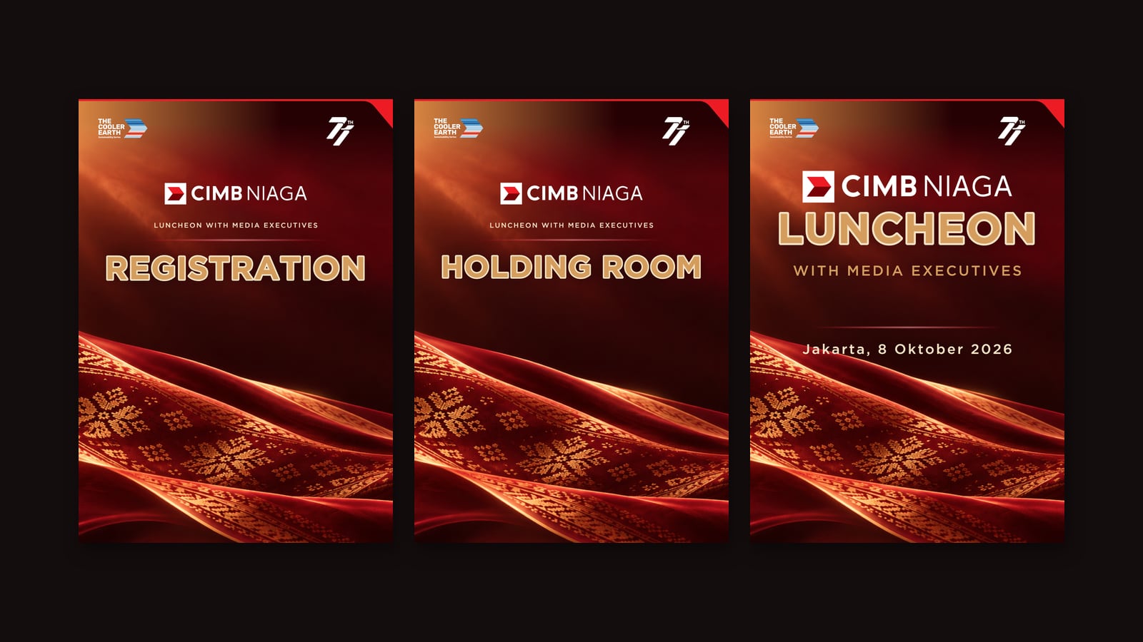
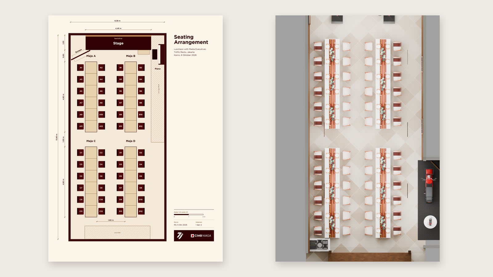
The room. Signage for registration, the holding room and the luncheon itself, a 90 x 240 cm fabric banner, a seating plan at 1:40 for 48 guests in four table sections, and 3D visualisations of the dining room built on the event production model, so the table setting, florals and stage could be approved before anyone set foot in the venue.
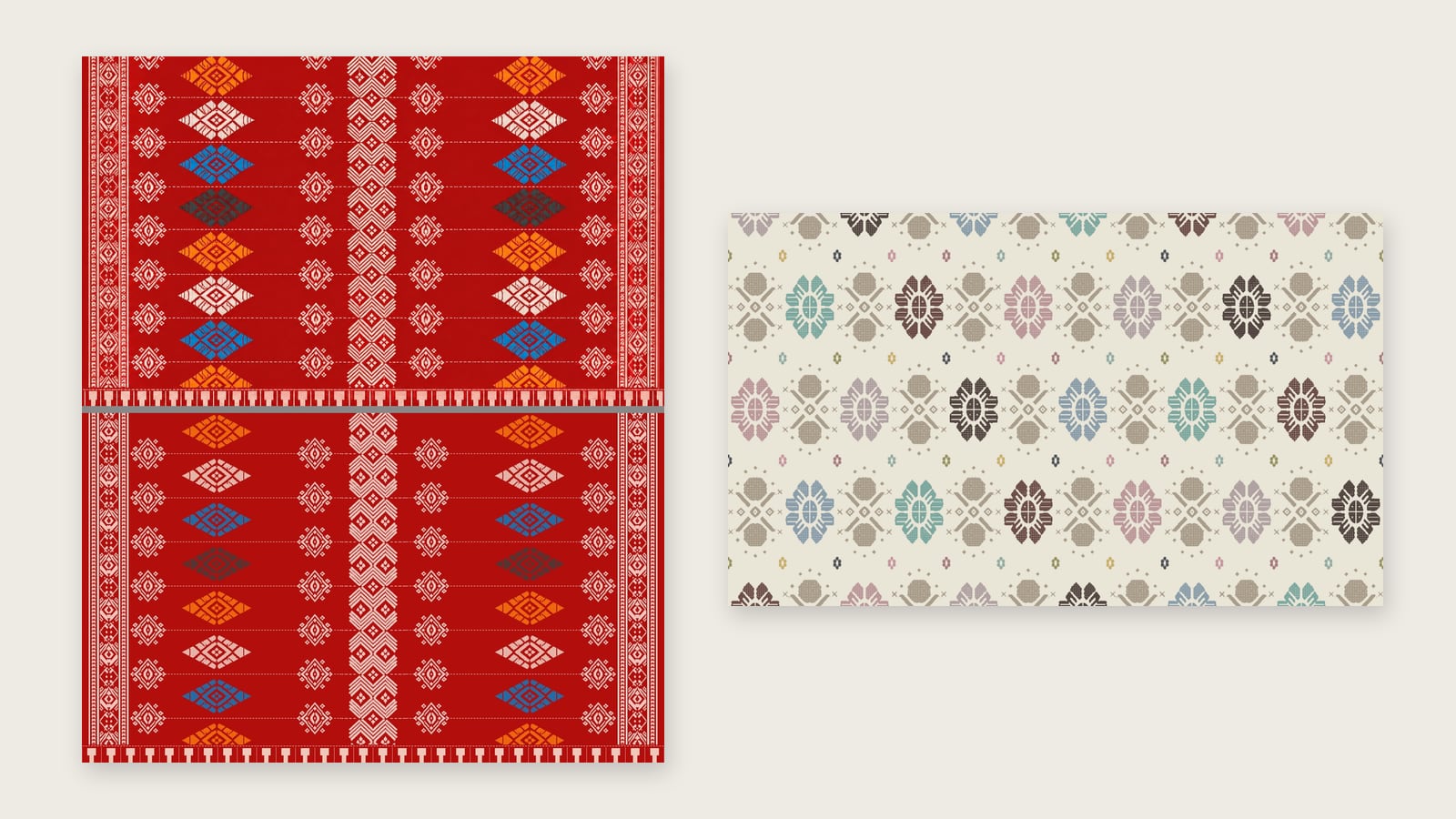
Textiles, rebuilt properly. Two cloths for the room, a red motif and an ivory songket, had to print at 200 x 120 cm, and the source files were small images stretched to size. We traced every motif into clean vector artwork, so the weave stays crisp at full size instead of turning into soft blocks.
Screen and production. Song lyric slides in 16:9 for the afternoon’s medley, then a print package for every item: CMYK files with bleed, crop marks, fold marks and dielines, text outlined, and a specification sheet the printer could work from without calling us.
How we worked
Feedback arrived in rounds, sometimes late at night, and each round touched several items at once. Every round went back as a complete set, earlier versions were archived, and final files were named so the printer could not pick the wrong one. Before anything left the studio, every page was rendered again and checked for colour, typos and the small things that ruin a print run.
What it changed
Twenty families of material, one visual voice. The name on the table matched the name on the card, the menu matched the kitchen, and the room matched the renders the client had approved. For an event built on gratitude, every detail had to say the same thing: thank you.
Planning an event, a launch or a gala? See what WHITE Canvas does for collaterals and print and brand identity, or start the conversation #withWHITE.